New product features | The latest in technology | The weekly debugging nightmares & more!

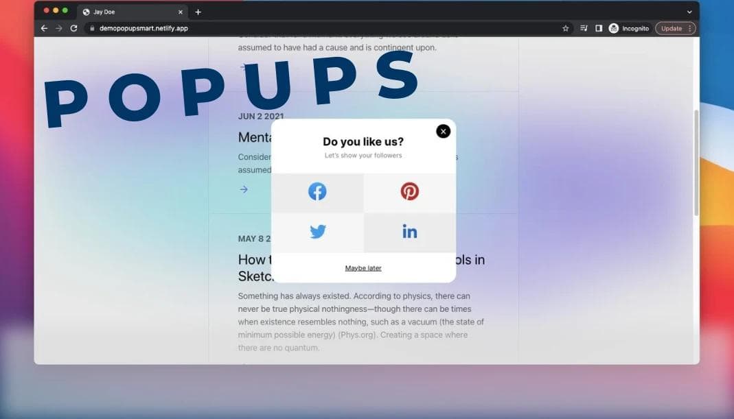
Easiest way to create popups in react
July 24, 2023
Nader Elmahdy
Take my knowledge and shove it up your brain...
Learn how to create popups the right way
If you've ever tried to create a popup from scratch, you'd probably go by creating a div with absolute position, the width of the screen, and the height of the screen, giving it a dark background then inside it another div which is the actual popup and all of that.
And this might work but there's a much cleaner way to do it and that's by using radix-UI.
radix-UI is a rich headless UI component library that provides amazing fully customized UI components that are fully supported on all browsers and devices and they have all the required aria labels so it doesn't mess up the accessibility of your website.
Benefits
So what are the benefits that you get when using radix-ui Dialog instead of creating one yourself?
- It's much faster and easier
- It has all the featured users would expect like:
- The ESC key closes the popup
- When scrolling, you don't scroll on the page itself, you're locked inside the popup.
- Pressing TAB will let you jump between the items inside the popup but you won't jump outside.
- Focus is automatically moved to the modal.
3. It has all the aria labels and accessibility features that browsers like.
Installation
simply run npm install @radix-ui/react-dialog
Update your tailwind.config.js file to enable popup animations.
tailwind.config.js
1const { violet, blackA, mauve, green } = require('@radix-ui/colors');
2
3/** @type {import('tailwindcss').Config} */
4module.exports = {
5  content: ['./App.jsx'],
6  theme: {
7    extend: {
8      colors: {
9        ...mauve,
10        ...violet,
11        ...green,
12        ...blackA,
13      },
14      keyframes: {
15        overlayShow: {
16          from: { opacity: 0 },
17          to: { opacity: 1 },
18        },
19        contentShow: {
20          from: { opacity: 0, transform: 'translate(-50%, -48%) scale(0.96)' },
21          to: { opacity: 1, transform: 'translate(-50%, -50%) scale(1)' },
22        },
23      },
24      animation: {
25        overlayShow: 'overlayShow 150ms cubic-bezier(0.16, 1, 0.3, 1)',
26        contentShow: 'contentShow 150ms cubic-bezier(0.16, 1, 0.3, 1)',
27      },
28    },
29  },
30  plugins: [],
31};
Example
Modal.tsx
1import * as Dialog from '@radix-ui/react-dialog';
2import { Cross2Icon } from '@radix-ui/react-icons';
3
4const DialogDemo = () => (
5  <Dialog.Root>
6    <Dialog.Trigger asChild>
7      <button className="text-violet11 shadow-blackA7 hover:bg-mauve3 inline-flex h-[35px] items-center justify-center rounded-[4px] bg-white px-[15px] font-medium leading-none shadow-[0_2px_10px] focus:shadow-[0_0_0_2px] focus:shadow-black focus:outline-none">
8        Edit profile
9      </button>
10    </Dialog.Trigger>
11    <Dialog.Portal>
12      <Dialog.Overlay className="bg-blackA9 data-[state=open]:animate-overlayShow fixed inset-0" />
13      <Dialog.Content className="data-[state=open]:animate-contentShow fixed top-[50%] left-[50%] max-h-[85vh] w-[90vw] max-w-[450px] translate-x-[-50%] translate-y-[-50%] rounded-[6px] bg-white p-[25px] shadow-[hsl(206_22%_7%_/_35%)_0px_10px_38px_-10px,_hsl(206_22%_7%_/_20%)_0px_10px_20px_-15px] focus:outline-none">
14        <Dialog.Title className="text-mauve12 m-0 text-[17px] font-medium">
15          Edit profile
16        </Dialog.Title>
17        <Dialog.Description className="text-mauve11 mt-[10px] mb-5 text-[15px] leading-normal">
18          Make changes to your profile here. Click save when you're done.
19        </Dialog.Description>
20        <fieldset className="mb-[15px] flex items-center gap-5">
21          <label className="text-violet11 w-[90px] text-right text-[15px]" htmlFor="name">
22            Name
23          </label>
24          <input
25            className="text-violet11 shadow-violet7 focus:shadow-violet8 inline-flex h-[35px] w-full flex-1 items-center justify-center rounded-[4px] px-[10px] text-[15px] leading-none shadow-[0_0_0_1px] outline-none focus:shadow-[0_0_0_2px]"
26            id="name"
27            defaultValue="Pedro Duarte"
28          />
29        </fieldset>
30        <fieldset className="mb-[15px] flex items-center gap-5">
31          <label className="text-violet11 w-[90px] text-right text-[15px]" htmlFor="username">
32            Username
33          </label>
34          <input
35            className="text-violet11 shadow-violet7 focus:shadow-violet8 inline-flex h-[35px] w-full flex-1 items-center justify-center rounded-[4px] px-[10px] text-[15px] leading-none shadow-[0_0_0_1px] outline-none focus:shadow-[0_0_0_2px]"
36            id="username"
37            defaultValue="@peduarte"
38          />
39        </fieldset>
40        <div className="mt-[25px] flex justify-end">
41          <Dialog.Close asChild>
42            <button className="bg-green4 text-green11 hover:bg-green5 focus:shadow-green7 inline-flex h-[35px] items-center justify-center rounded-[4px] px-[15px] font-medium leading-none focus:shadow-[0_0_0_2px] focus:outline-none">
43              Save changes
44            </button>
45          </Dialog.Close>
46        </div>
47        <Dialog.Close asChild>
48          <button
49            className="text-violet11 hover:bg-violet4 focus:shadow-violet7 absolute top-[10px] right-[10px] inline-flex h-[25px] w-[25px] appearance-none items-center justify-center rounded-full focus:shadow-[0_0_0_2px] focus:outline-none"
50            aria-label="Close"
51          >
52            <Cross2Icon />
53          </button>
54        </Dialog.Close>
55      </Dialog.Content>
56    </Dialog.Portal>
57  </Dialog.Root>
58);
59
60export default DialogDemo;
The above is an example provided by radix-UI team, you can copy-paste it and modify it to your liking.
You might also like:

I tried the 2 best UI libraries. Here's my experience.
Is shadcn that good? or is nextUI going to take over?

How to add Dark mode in Next js 13
You can choose to enable dark mode, but my childhood was dark by default

Creating notifications never been so easy
It only takes 3 lines of code to create a beautiful notification in React js